

Objective
The ParkATX app—Austin’s go-to parking app—was built for revenue collection, not equity. I led a redesign focused on people who rely on free or low-cost parking. This work reframes civic tech to center community knowledge and access.
The problem: The existing app focuses on collecting payment and excludes many options used by low-income and disabled residents. Usability gaps reinforced inequities in visibility, cost, and physical access.
The goal: A community-sourced feature that helps users find safe, accessible, and low-cost parking—and a shift in the app’s goal from enforcement to support.
CLIENT
City of Austin
TOOLS
Figma, Maze, Google Docs
MY ROLE
Product Strategist & UX Designer
I led product strategy and UX design, translating research into user journeys, emotional barriers, and a community-first MVP. I built prototypes in Figma, ran usability tests with 10 drivers, and designed a crowd-sourced parking feature to promote access, safety, and trust, shifting the app’s focus from enforcement to equity.

Audience research & Insights
Target Audiences:
Conducted interviews with residents navigating the transportation issues in Austin, especially regarding parking in the city limits.
Created journey maps to visualize barriers, like unclear signage and unpredictable enforcement.

Key Insights
Most users rely on memory or the chance to find free or affordable parking.
The current app doesn’t help people find parking, just manages payments.
Information about parking prices and locations is located on the government website.
Safety, walkability, cost, and trust were key decision factors.
Emotional barriers—fear of fines, anxiety, and frustration—were just as significant as logistical ones.

Product Strategy
Jobs To Be Done
“Help me find free or low-cost parking I can actually trust—without risking a ticket.”
“Let me know what’s safe and accessible before I get there.”
“Show me that this app is for people like me—not just for collecting money.”
MVP Features
Community-Sourced Parking Map – Residents can share and validate free or affordable spots.
Add a Spot Flow – Simple, guided input to let users share free or low-cost parking with just a few taps.
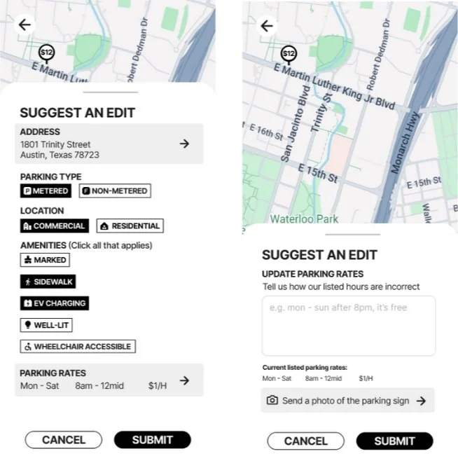
Suggest a Change – Simple, guided edit tools to let users update outdated or inaccurate parking info.
Smart Prompts – Location-based nudges (e.g., “Did you just park here?”) that invite users to quickly add or confirm spot details—turning everyday actions into low-effort contributions.
Guiding Principles
Treat users as contributors, not just payers.
Center equity, accessibility, and local knowledge.
Build trust through transparency and usability.

Design Process
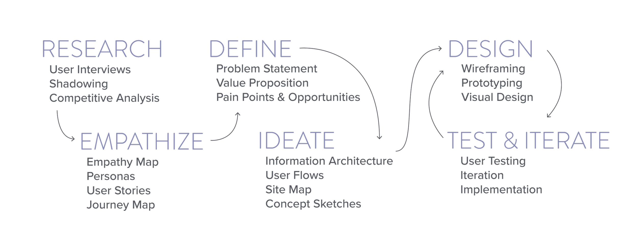
Ideation & Mapping
Used Miro to brainstorm and prioritize features. I did a competitive analysis of other parking apps. However, most focus on payment and community sourcing apps like Gasbuddy or Yelp, which are about sharing community knowledge. I created emotional journey maps to understand friction and opportunity.

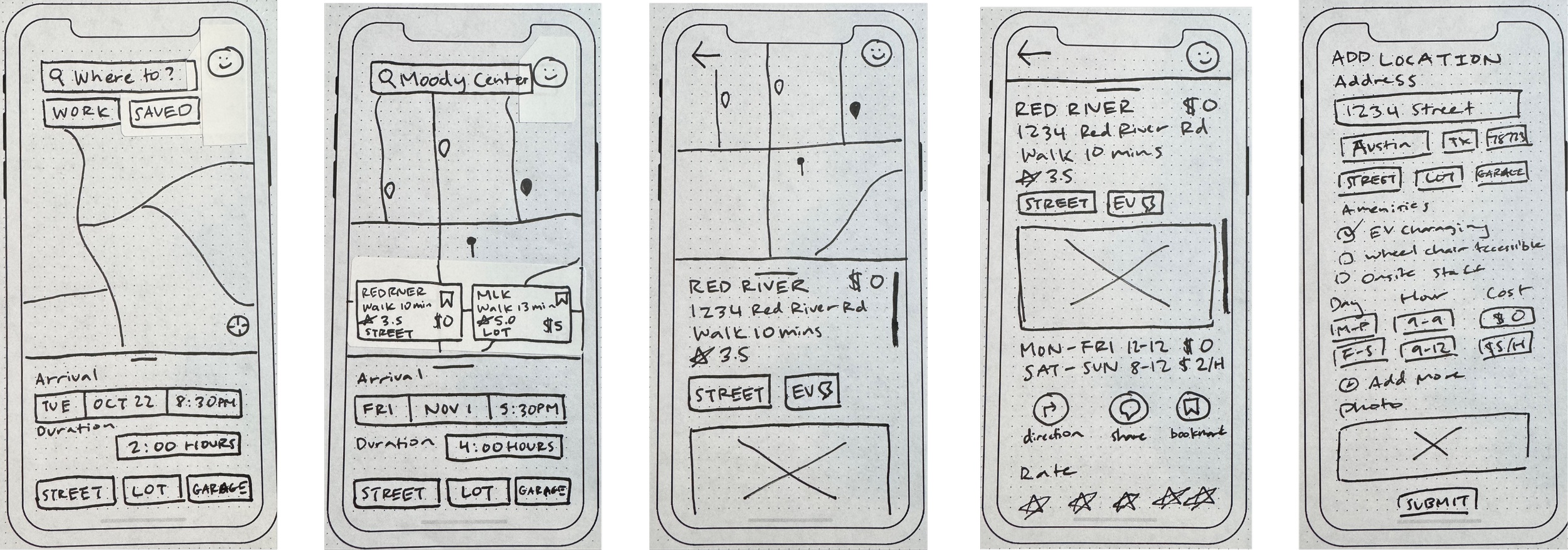
Wireframing & Low-Fidelity Prototype
Built flows for: “Search Spot”, “See Spot Details”, “Add Spot,” “Update Details,” Iterated based on peer feedback to simplify flows and reduce ambiguity.
High-Fidelity Prototyping
Created a working prototype that included accessibility standards while honoring the key features. Research how other apps encourage community input and knowledge sharing, especially how folks update wrong information on maps.

Usability Testing & Iteration
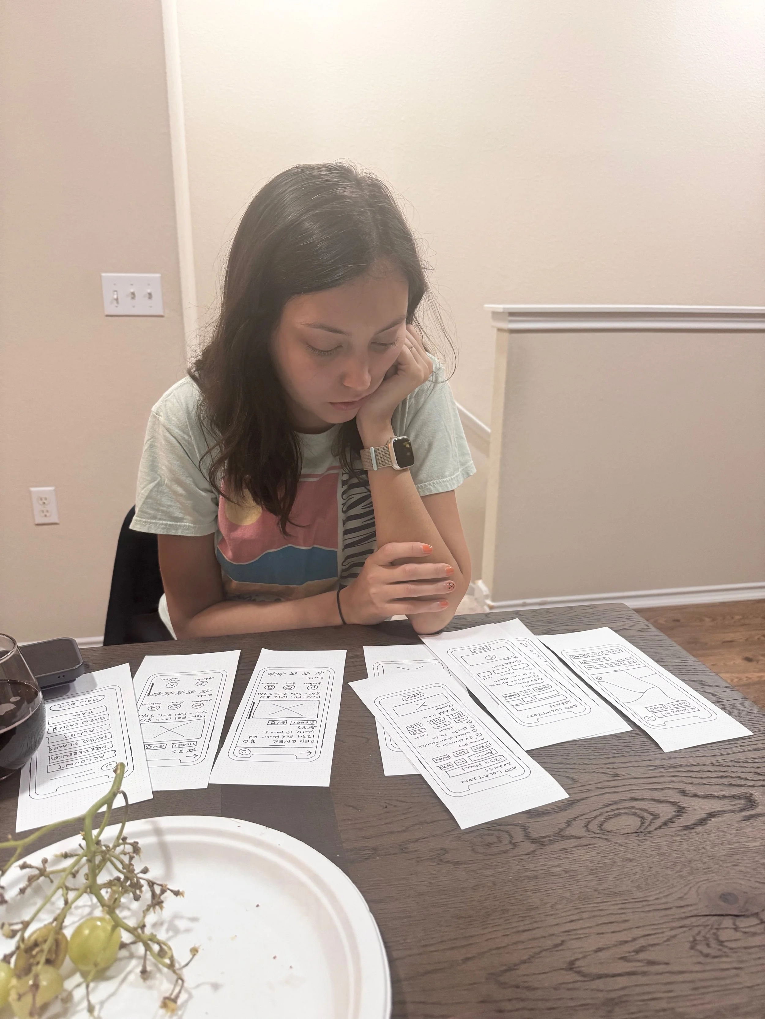
Conducted tests with Maze:
The user found the filtering system intuitive and appreciated being able to sort by safety and distance quickly
“Add a Spot” felt empowering, but some prompts were unclear.
There was a clear desire to get information quickly versus having complete information. Users just wanted to find the spot versus learning about the spot.
Before: Pins and labels not text based

Before: Edit a location using dense radio buttons and small text field
After: Update with pins with prices and icons for labels
After: Edit a location using large tap-friendly labels, clear categories, and open text boxes

Solution
Community-Sourced Parking Tool
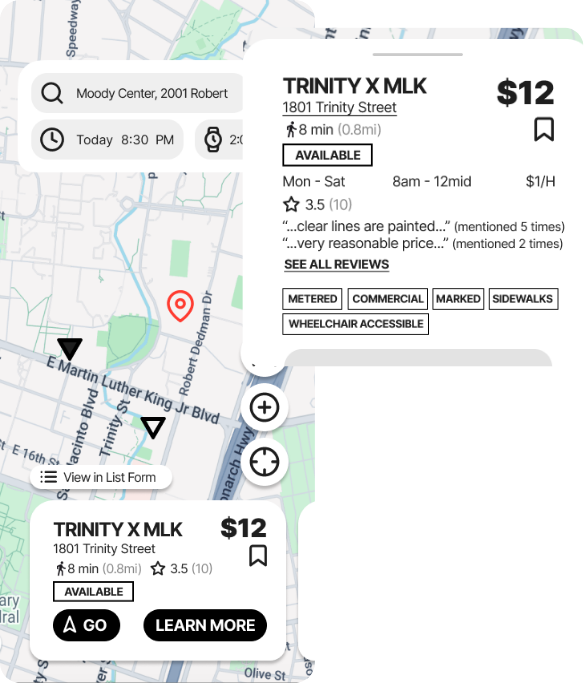
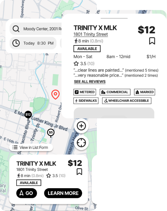
Designed an intuitive, map-based experience modeled after tools like Google Maps
Enabled users to search by location and filter by price, accessibility, time limits, and more
Prioritized clarity of information—each listing shows price, restrictions, and recent confirmation at a glance
Built trust through community-driven indicators like ratings, reviews, and contributor reputation
Contribution Design
Streamlined the submission process to make adding or editing spots feel like leaving a Yelp review
Allowed users to upload photos, add notes, and flag inaccuracies with just a few taps
Encouraged community contributions through quick prompts and mobile-friendly design
Created a feedback loop where user insights improved accuracy and trust over time
Empowered locals to surface hyper-relevant, often-missed parking knowledge for others

Outcomes & Impact
High usability scores
for visualization and filtering features.
Strong qualitative response
to user-centered framing.
excitement from stakeholders
around pilot testing

Why it MATTERS
This project rethinks civic tech through a justice-oriented lens. By shifting the ParkATX app’s priorities from revenue to access, we empower residents to navigate their city with dignity.
Helping adult children practice tough conversations with parents, building confidence.